Frustration and indecision
When it came to the new book, The Devil’s Accompanist, I thought I knew what I wanted and I had stumbled upon this book cover last year (see above) and I just loved the tone, the colours and image and thought something along those lines would be great. Good news followed soon after as early stock images searches unveiled this quite brilliant picture (see below) and I thought, ‘yes, that’ll do nicely’. Things were looking up. What I liked about it is the way it portrays loneliness with a hint of despondency, a woman lost, unsure of herself while walking around an old building…or at least that’s what I saw. It was perfect for the story.

Of course, it’s never that simple. When you look through stock imagery, the site usually brings up other pictures that are either, part of the same collection, by the same artists, similar pictures or, in many cases, all three. Sadly, this picture is not part of a collection, it was a one off, but at least I had a cover, right?
Yes, I did have a cover, one cover, but the problem which arose soon after was similar to The Eyes where the second cover is far superior to the first cover. I was never really happy with the first cover and I thought, with the coming of the first story’s full length follow up, here is a good opportunity to re-release Thank You For The Music with a lovely new cover. This is when the trouble started.
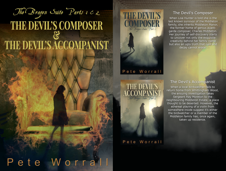
The problem I had was the differing lengths of the books. Thank You For The Music is a short story (18,000 words) and The Devil’s Accompanist is a full length (90,000 words). Could I successfully release the books as a part 1 and part 2 with the over-arching name of The Brazen Suite?
I had done some research into the best way forward and found that serials sell better than stand-alone books. It might not sound correct, but we humans love serials. Most of our TV dramas are serial based with cliff hangers keeping you on the edge of your seat until the following week. Hell, it’s the very basis our binge watching, box set culture is based upon. Ok, so I now have a part 1 and part 2 but they are of differing lengths, does this matter? Possibly, readers like something to get their teeth into and 18,000 words for part 1 is probably not going to cut it, but I was struggling to combine the two stories into two 54,000 word books. I then thought about splitting it into 3 parts. Part 1 would be the original 18000 word short story and parts 2&3 would be the new full length split into 2 x 45,000 word books. I went with this idea for quite a while but felt Thank You For The Music was not a good a title as The Devil’s Accompanist. Surely, if I’m going to make them a series, the titles must relate as well. I came up with The Devil’s Composer and The Devil Likes to be Serenaded and was quite happy with the way the series was shaping up. Sadly, the cover art had other ideas.
Three of the tips for creating serialised cover art is to: 1, Make them look like they’re related so they at least look like they’re part of the same series. 2, Have a human element to it. 3. Use fewer colours. The problem with making it a 3 book series was suddenly having to produce three front covers that adhered to these tips. I already had one I was happy with, yet the cover for Thank You For The Music didn’t look like it was related to The Devil’s Accompanist, nor did it have a human element. So, two covers had to be created to complete The Brazen Suite series…simple, yes?
I was going to need help so I got in touch with my good friend Chris Linaker again and we both set about discussing what the themes were and potential ideas. What followed was a period of passing back and forth possible covers and images that might spark some inspiration. I was up to my old tricks of being very vague about what I wanted, I just knew what I didn’t want. It didn’t help that I was indecisive about the book titles as well. The names changed around so often that they became meaningless for the cover art. It was a case of, ‘get the artwork sorted first and I’ll worry about what to call it at a later date’.
The following designs were quick mock ups by Chris and myself. I knew I wanted something to relate to the image for The Devil’s Accompanist and so went for pictures that were dark, had a woman in the image and were fairly mysterious. Although frustrating Chris to the point of distraction, he did keep me on track by asking the very simple question, ‘does it represent the book?’ Almost all of the time it didn’t, and he pointed out that some of them, although darkly lit, could pass off as romance book cover rather than the horror/mystery story I’d written.


Because producing just one of the two required covers was creating headaches, I decided to back track my decision on making it a three part series. So, Chris and I were back to creating just one cover and I made the executive decision of keeping the titles of The Devil’s Composer and The Devil’s Accompanist, the former replacing Thank You For The Music.
Chris asked me about other themes in the book and he came up with some different ideas including a woman overlooking London, a picture inside a picture and the hands of the devil, which I think is utterly brilliant but not suitable for what I was after. It has gone into the, ‘for use later’ folder, so we may see it again at some point.

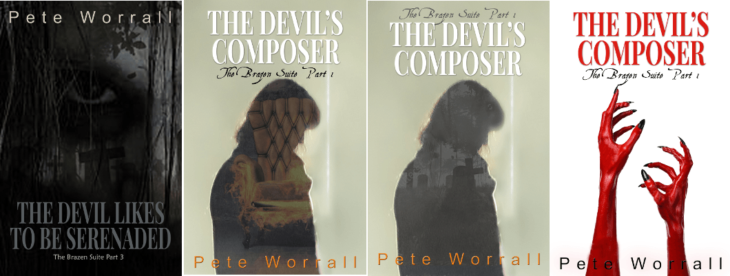
Looking at other writers and their serial covers, I noticed a few serials used the same picture but altered a certain aspect of it. I approached Chris and suggested the idea and somehow, I’m yet to find out how, he managed to remove the woman in The Devil’s Accompanist. This opened up ideas of replacing her with another woman either listening to music, playing music or in a different pose. I liked these ideas but we never hit on anything that I was 100% behind, that was until Chris just moved the original woman and added a shadow. That was it, I was sold. All the weeks of frustration could all have been avoided if only either of us had thought of moving to woman slightly to the left. Chris added a gramophone and I asked him to darken and then fuzzy up the shadow a bit more and, tadaaaah, it was almost there. From the window on the right I added more of an orange glow which I really liked because it just took down the amount of colours (see tip 3) and the overall brightness. That was it job done…sort of.
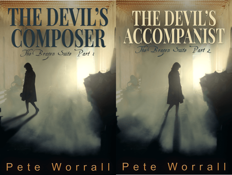
I gave Chris the correct names and he finished of the titles. The downside was the fact that these covers would be for the individual ebooks. I wanted to create a version containing both parts so I could offer readers a combined paperback version. Part 1 has never had a paperback release and some people have not read it because they don’t have a kindle or ebook reader. In my mucking about, I had bought an image of a chair on fire (nice) and thought it fitted the imagery of the story quite well. I took some of the colour out of it and made a slight change in its hue. I had it in my design program and by sheer fluke I accidentally put The Devil’s Accompanist cover over the top of it. Instead of removing it, I made the white transparent and the result was something that really appealed to me. I liked the way the woman was walking in the flames and the chair is iconic to me and hopefully anyone else who has read the story. I liked it enough to make it the front cover for the paper back with the reverse including the covers of the book’s individual parts. I passed it over to Chris for a final opinion and once he put the titles on it, that was it, job done…until next time.
I’m really happy with the way the cover art has turned out for The Brazen Suite. It’s probably the most frustrated I’ve been when creating covers but I think they’re my favourite out of all the covers Chris and I have produced so far. It’s all been worth it...just.