Anything for the Honey
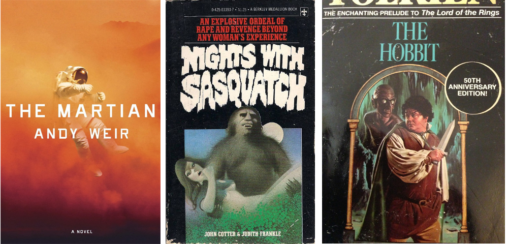
After The Eyes story was complete, I wrote a couple of short ghost stories. Because I was only planning an ebook/kindle release for them I didn’t want to invest too much time in designing the covers, especially for a piece of work only 11,000 words long. I’ve since realised this is not the case and ALL covers should be eye catching and appealing regardless of how long the book is. People are drawn to good covers, it’s just the way of things. Out of the following books, which ones would you be tempted to pick up first?
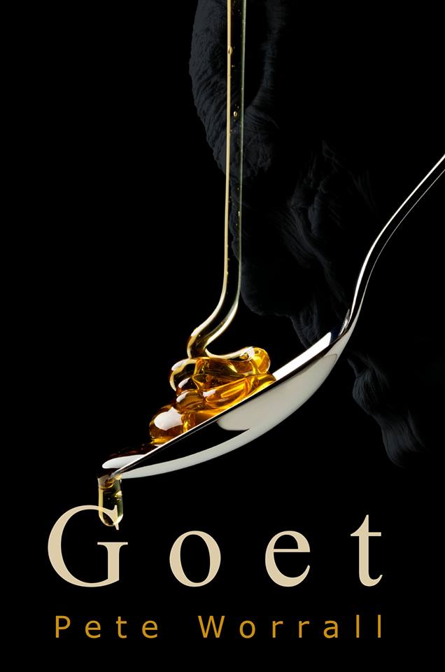
I like to think at least one of the two ghost stories I released had a decent cover, that story was Goet. One of the advantages of creating artwork for a simple short story is you only have a few themes to choose from unless you’re planning to go completely avant garde and have a design that bears no resemblance to the content. Goet is a tale about a divorced, middle aged man who is possessed by an unknown spirit that requires honey to build up its strength in order to fully take over its host. The two themes that leapt out were the spirit and honey. A quick look on istock and two images struck a chord. I pieced them together but pushed the spirit more towards the background and that was it, job done in about half an hour, a new record. It’s simple but effective and perfect for the short story, but more importantly, I didn’t have to annoy Chris Linaker.
The second ghost story, Thank You For the Music (The Devil’s Composer), was not as straight forward and it highlighted one of the big issues with cover design. It’s only natural for your cover to represent the themes in the book or a snapshot of the ideas in the author’s mind, but if the story is a mystery or has a lot of revelations running through it, what do you include on the cover so not to give away any spoilers? The ideas in my head for Thank You For The Music that would’ve made a great cover, would’ve given the game away, perhaps not all of it, but certain aspects. The covers for The Eyes were perfect as they didn’t really reveal much at all, but Thank For The Music, and, subsequently as I found out, The Shimmer at Fog Cottage and The Devil’s Accompanist, all had initial ideas that, potentially, could reveal too much.
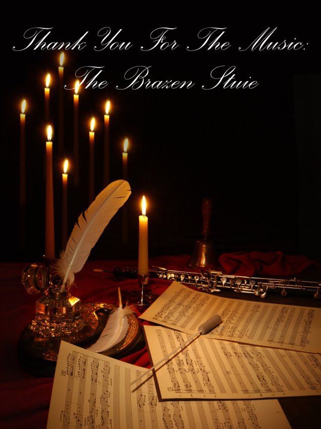
In the end I opted for a violin with the colour drained out of it. There is a picture on Charles Middleton hidden in the window but I had designed it so poorly that you can’t really see him unless I point him out, and then you still might struggle. I was never happy with it and I’m still not hence why it’s getting a make-over, but, at the time I remember really struggling with an image for the story that didn’t give too much away. I thought about including a picture of a manor house but didn’t find a suitable picture of one. None of the ghost stock pictures were of a haunting by an elderly gentleman, they all seem to be by scary children or beautiful women. It was a frustrating process resulting in a finished product that wasn’t terrible in my opinion, but it certainly wasn’t good enough.

Even when it came to revisiting the cover art for Thank You For The Music, I still struggled with finding suitable imagery. It meant, once again, trawling through the thousands of stock images in an effort to find one that kindles interest and sparks the creative process. As I’ve probably already mentioned, as frustrating as this process is, it needs to be done, and if you end up with a cover art you’re proud of then it was a process worth enduring. The book's new artwork will be revealed in part 5.
In the next part, I will look at The Shimmer at Fog Cottage and 3rd party covers.