A stick of broccoli

The ole saying of ‘don’t judge a book by its cover’ is absolutely true. Sadly, it’s something we all do, which is why it’s essential to have a cover design that is provocative, eye catching, thought-provoking and well put together. It’s easier said than done unless you’re a wealthy author who can hand all of the cover art process to a professional artist and say, “it’s about goblins, vampires and shape-shifting unicorns, away you go.” A month later you may have a dozen or so designs to pick and choose from, what a luxury that would be. From a personal perspective, I can’t really afford the services of a professional cover designer. Actually, let me rephrase that; I could probably afford the services of a professional cover designer to come up with an initial design, it’s all the finicky changes I would need that would ramp up the bill beyond the limitations of my wallet (I can be a pain in the neck at times).
In the end, I find myself tackling the cover design myself and it’s a process I both love and loathe. I love it because when it’s finished it’s a snapshot, a negative, a frame of my imagination captured in full glossy colour. Knowing a great cover will be the end result is motivation itself to push and maintain the patience to produce the best work I can at the time. I loathe the process because it’s a tedious, frustrating and long winded operation that takes seven times longer than it ought to.
Thankfully, I’m in the fortunate position to call on my good friend Chris Linaker whose eye for design and creative flair has helped create almost all of my book covers. I know I drive him crackers at times with my indecision and fussiness, but he knows it has to be right and it’s worth putting in the time and effort.
When I first started writing in the late 1990s, I, like many writers starting out, just wanted to write a story and maybe, just maybe, someone from my immediate family would read it. Discovery House was my first book and existed as a ream of A4, its cover was the colour of the Lever Arch file it was crammed into (black if I remember). My writing aspirations were to finish and to have my brother read at least some of it. There wasn’t a need to create a cover. Fast forward to 2005 and that moment when the idea for The Eyes came into my head. I felt the idea was a strong one, in my opinion stronger than Discovery House, and set about writing the book with the same aspirations, 1. Finish it, 2. Buy a new Lever Arch file, 3. Print it out, 4 Get my brother to read it.
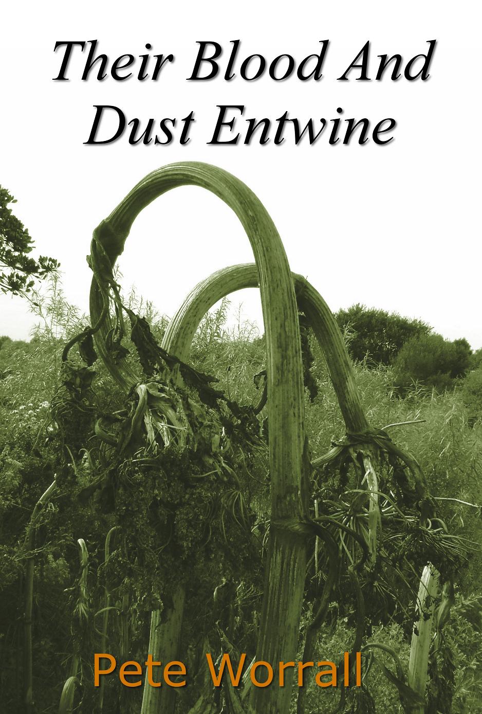
It wasn’t until I saw an ex-work colleague’s book, Dave Ditchfield’s Yuptoo, which he produced himself, that I realised it was possible, for a minimal cost, to turn They Grow Upon The Eyes into an actual ‘hold it in your hand’ book rather than a ‘rest it on your lap until your thighs go numb’ book. Of course, the book needed a cover, and with aspirations of an audience still rooted firmly in immediate family, I didn’t put much thought into it. My phone at the time had a decent camera so while out on The Eyes with the dogs, I snapped a few Giant Hogweed and used my favourite photograph as the cover, albeit with a sepia, slightly mottled filter over it.
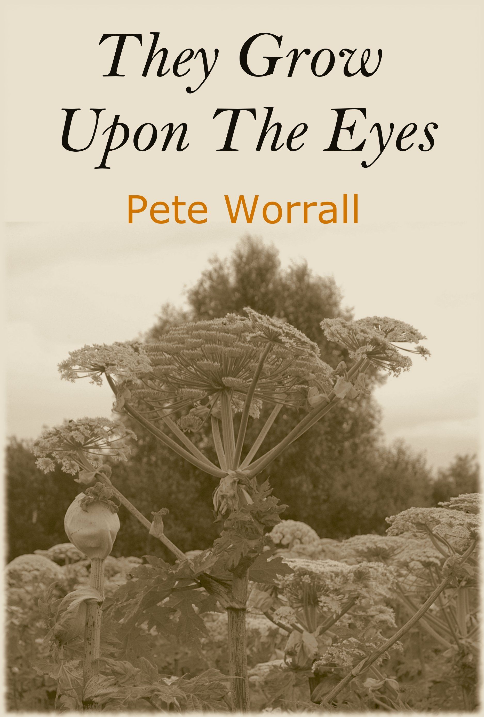
I was pleased as punch with it; especially when a copy arrived at my house and I could actually hold it (it’s a thrill I still get to this day). Having an actual book meant I could give it to people outside of my immediate family because a book is less daunting than a ream of A4. Not even I knew how much interest it would generate, but it wasn’t until my writing tutor quipped to some other students that it looked like a stick of broccoli that i realised perhaps it was not the best picture to put on the front of a book. She was right but I didn’t know any better at the time so I left it.
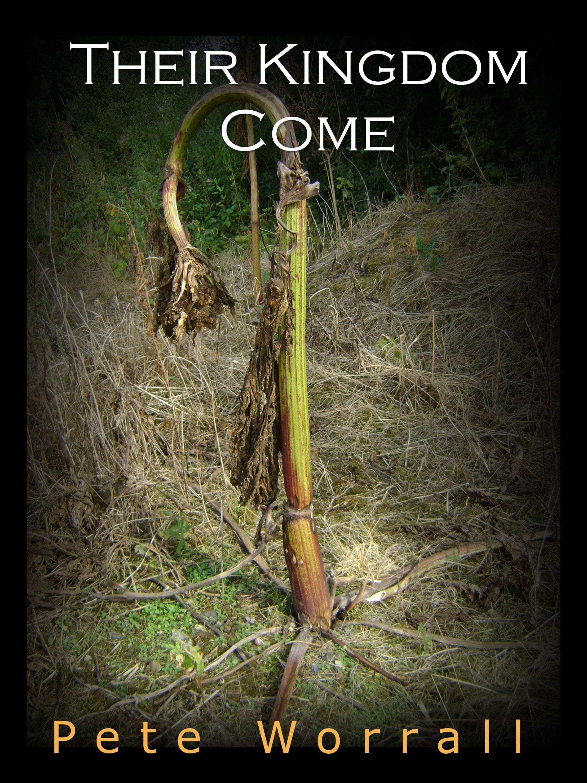
Three years later when the sequel to They Grow Upon The Eyes, The Doom of the Hollow, was finally finished, I knew I had to produce it for an audience keen to read the next part of the story, however, I was still stuck in the ‘broccoli’ mindset and went back onto The Eyes with my camera, but this time the Giant Hogweed was dying. Here are a few example covers I toyed with, including possible titles for book 2 (thank goodness I changed them).
It wasn’t until my brother said, “I don’t think a dead plant makes a very good cover,” that my attitude to cover art changed because he was right. I was too focused on producing something that ‘would do’ because it was within my limited capabilities both with my design software and artistic eye. It was at that moment I spoke with my friend Chris Linaker and he kindly offered to help me. Even then the process was far from plain sailing, in fact, it started a long arduous task that drove us both mad. This is covered in part 2 of this cover art process.
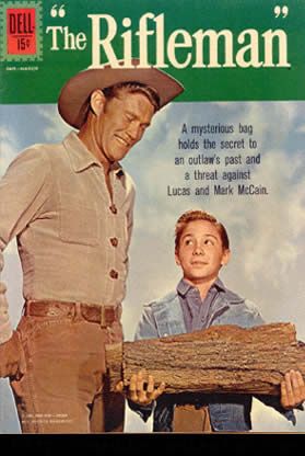
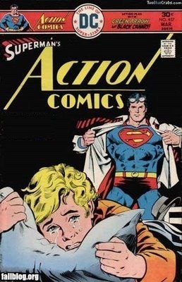
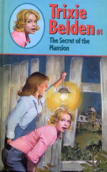
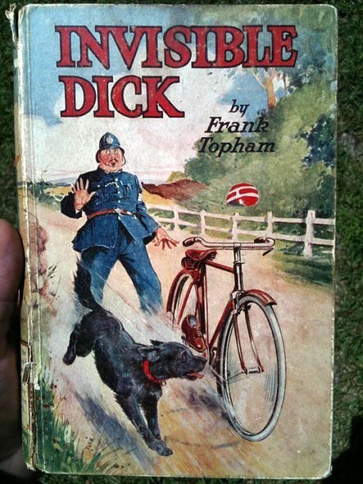
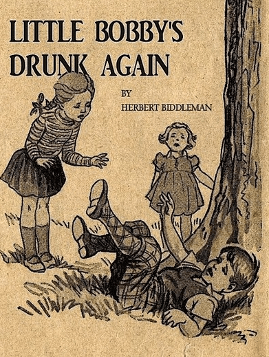
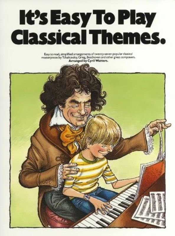
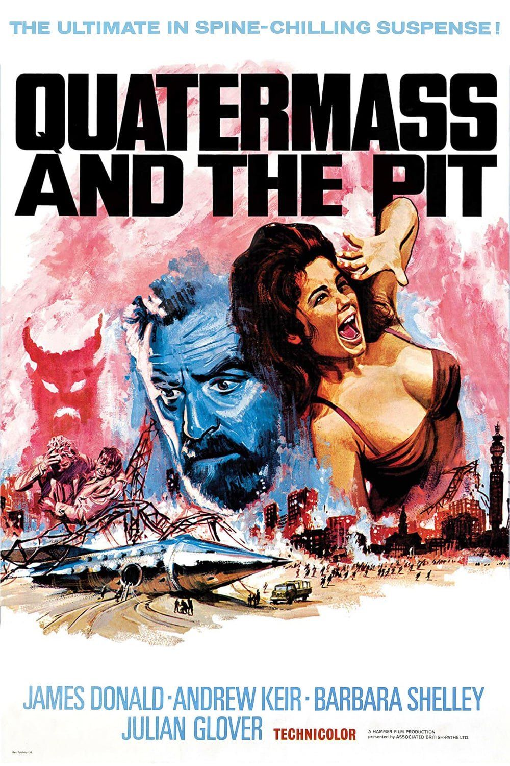
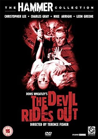
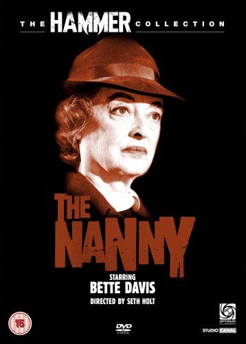
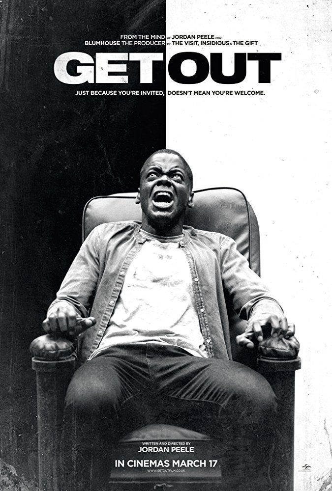
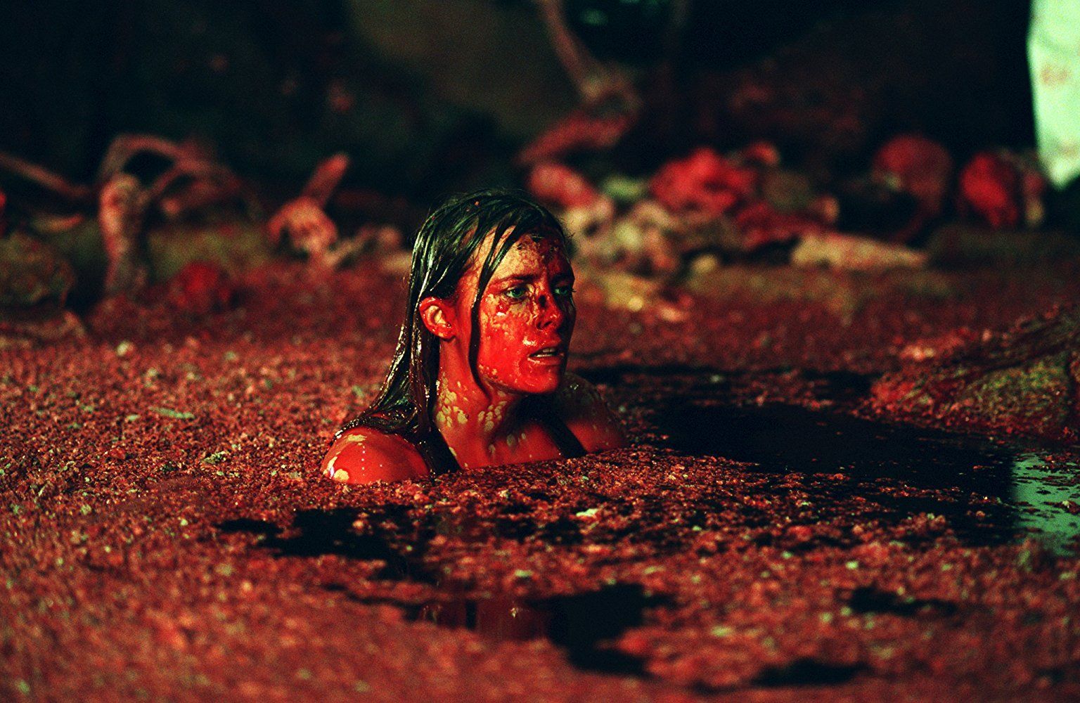
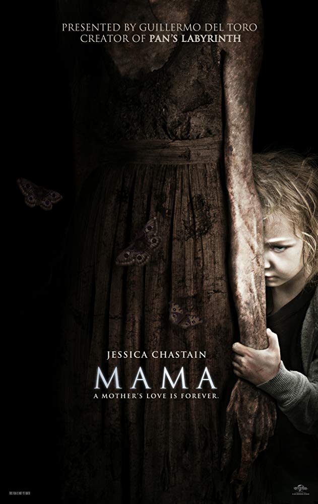
Here are some of my own personal favourite covers. Disclaimer, I cannot vouch for the content or the actual existence of these books, but from a cover point of view, I don’t think my first attempt would look too much out of place with this lot.